DE dashboard
For many of our projects, we include a link to a DE dashboard displaying differential expression (DE) analysis results. This page provides a tutorial on how to navigate the dashboard and interpret the results.
Try it out
Open a DE dashboard to follow along the tutorial.
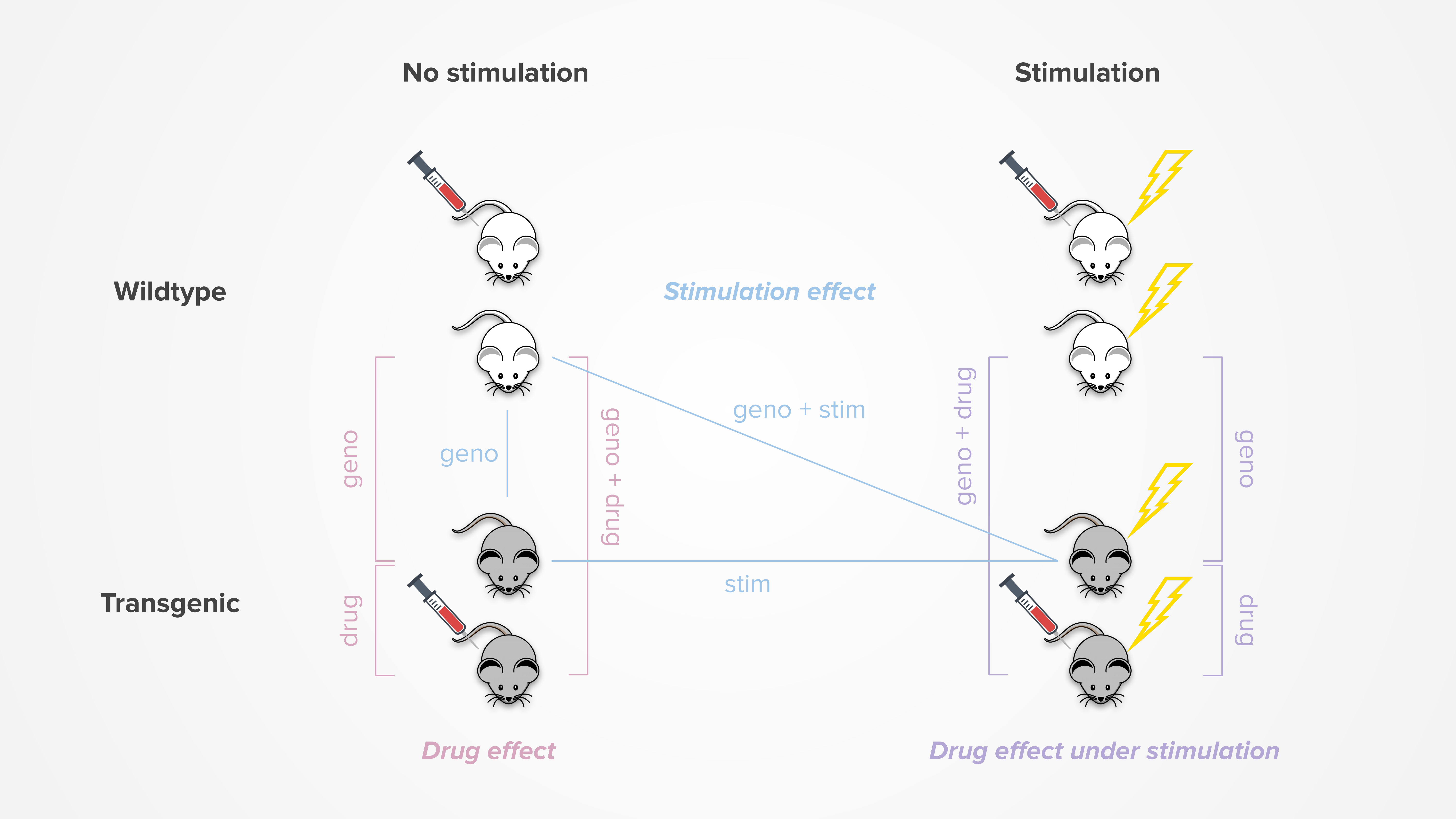
On the left-hand sidebar for each dashboard, use the dropdown menu to select between different analysis results. For bulk sequencing projects, options include drug effect, drug effect under stimulation, and stimulation effect (details below).
For single-cell sequencing projects, the analysis is always drug effect and the dropdown menu is used to select the various cell types. Further, once a cell type is selected, tabs will appear on the sidebar to view results for all cells of that type or by subcluster within the cell type.
Table of contents
Genes table
At the bottom half of the dashboard, under the Genes list tab, there is a table of genes used in the analysis, as filtered by the following criteria defined by Ensembl:
- Located on chromosomes 1-19, X, Y, MT
- Is not a pseudogene or TEC (To be Experimentally Confirmed) (see gene biotype)
Try it out
In the genes table, hover over the gene name under the Symbol column to view its chromosome location and gene biotype.
For each gene, there is additional information on its differential expression analysis results, our categorization of its effect, what AD-related modules it belongs to, and whether it is categorized as a transcription factor or other protein type.
Note
For each column, there is a search field to filter the genes table by that column. Regular expression can be used in the search field and all text in the tooltip (i.e., hovered information) is searchable.
For categorical columns, the search field will be a dropdown menu. For numeric columns, there will be a range selector, but specific ranges can also be inputted by typing
min_range...max_rangein the search field (e.g.,0...0.5).
The Summary table tab contains summary data as described in more detail below.
DE analysis
Each of our projects involve a drug compound and a mouse model, thus all DE dashboards include a drug effect analysis. Additionally, some projects also applied theta-burst stimulation (TBS) treatment to try to induce long-term potentiation (LTP). These dashboards may include an additional drug effect under stimulation and/or stimulation effect analysis. For a more detailed stimulation analysis, check out our separate stimulation dashboard.
The figure below summarizes the pairwise comparisons involved in each differential expression analysis:
In the dashboard, the genes list table displays several metrics for each pairwise comparison, primarily the log2 fold change (LFC), associated p-value, and adjusted p-value. If apeglm effect size shrinkage was performed, the shrunken LFC and corresponding s-value may also be displayed. For single-cell projects, results can additionally include the percentage of cells where the gene is detected in each group.
Categorization
To help us understand the effect of each gene, we define the following 6 categories:
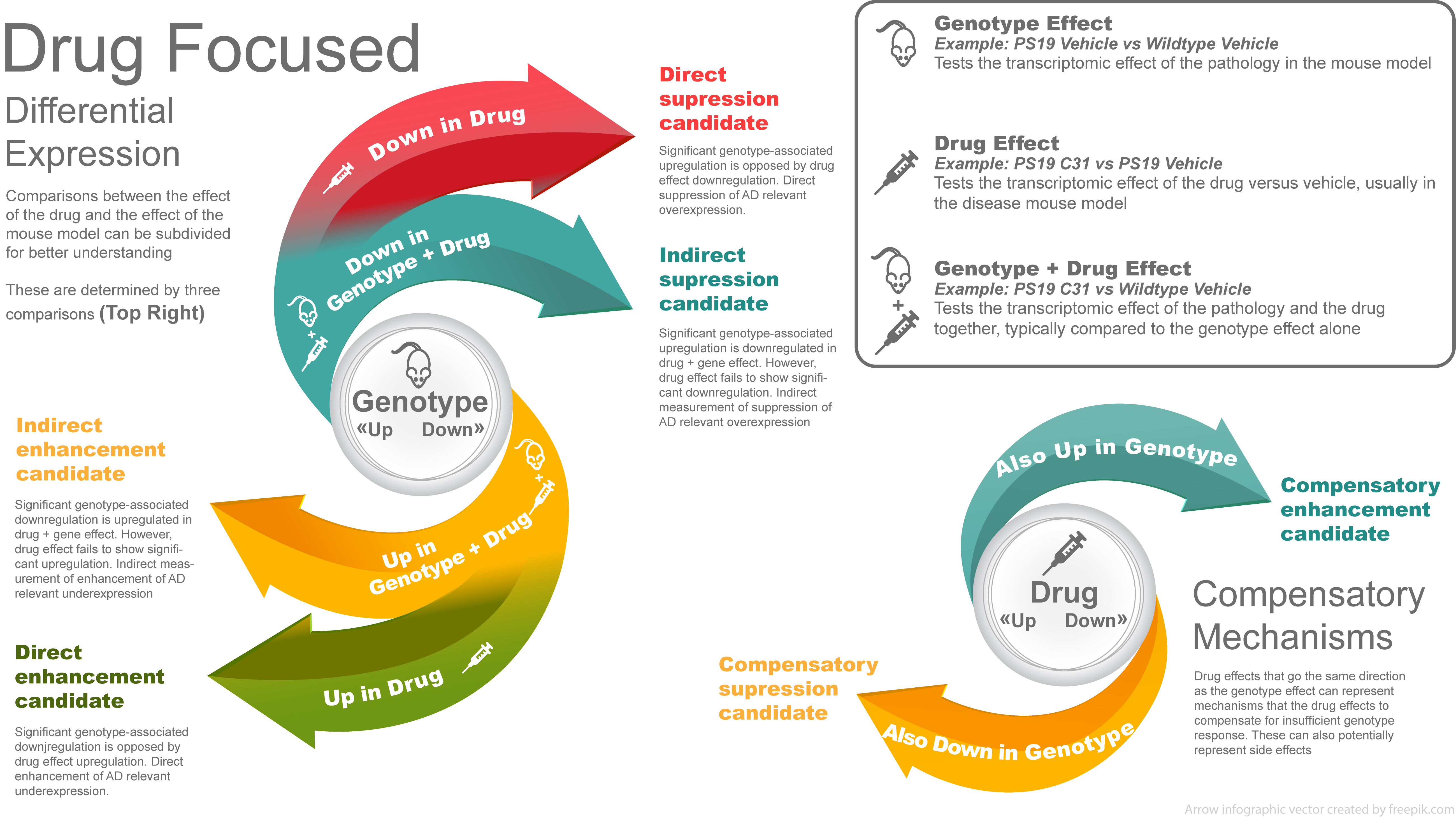
The same idea can be applied to the stimulation effect, where stimulation replaces drug in the definition.
The Category and Direct columns in the genes list table can be used to filter for genes that fall into each category. The number of genes per category can be found in the Summary table tab.
If the unshrunken LFC is used to define the gene categories, a LFC cutoff is applied as well as a significance threshold. If the shrunken LFC is used, only a LFC cutoff is applied. The specific fields and thresholds used can be found in the left-hand sidebar.
Modules
To help orient each gene in the context of Alzheimer’s Disease (AD), we use modules from multiple sources that attempt to categorize genes by function and disease relevance:
- TreatAD: TREAT-AD pathway traced modules from Cary, et al. (2022)
- Mostafavi: SpeakEasy gene modules from Mostafavi, et al. (2018)
- Milind: Submodules of human/mouse co-expression from Milind, et al. (2020)
- Wan: Submodules of human/mouse co-expression from Wan, et al. (2020)
- TmtAD: TMT-LP proteomic modules from Johnson, et al. (2022)
- Resilience: TMT-LP proteomic modules for Brodmann area 6 & 37 from Hurst, et al. (2023)
For each source, the genes list table indicates how many modules each gene belongs to.
Try it out
In the genes table, hover over the number of modules in each column to view the specific names of the modules.
Transcription factors
To help determine whether each gene is a transcription factor (TF) or other protein type, we use data from AnimalTFDB and ChEMBL.
AnimalTFDB is a comprehensive database that classifies transcription factors by families for multiple species. The AnimalTFDB column in the genes list table indicates which mouse TF family the gene belongs to, if any.
ChEMBL is a manually curated database that contains a more general classification of proteins, including but not limited to transcription factors. The number in the ChEMBL column indicates the number of classifications each gene belongs to. The mouse gene is used when available in the database, followed by the human ortholog gene.
Try it out
In the genes table, hover over the number of classifications in the ChEMBL column to view the data source and the exact classifications.
Analysis results
The main analysis results are located in the top half of the dashboard. A short description of each type of result and how to interpret them can be found below.
Module enrichment plots
The Transcriptomics enrichment and Proteomics enrichment tabs show the Fisher’s exact enrichment of each of the modules with our DE dataset.
Try it out
Use the buttons above the plot to toggle between the results for each module.
Each column in the plot is a module and each row is a subset of genes in our dataset, as defined by being up or down in the genotype, drug, or genotype + drug effect. A LFC threshold is applied to filter the genes. If unshrunken LFC is used, an additional significance filter (p-adj < 0.05) is also applied.
Each circle in the plot represents the overlap enrichment of the respective groups of genes. The bigger the circle, the higher the Jaccard index, which is a measure of similarity. The darker the circle, the more significant the overlap. Non-significant overlaps (where significant is defined as FDR < 0.05) are not displayed.
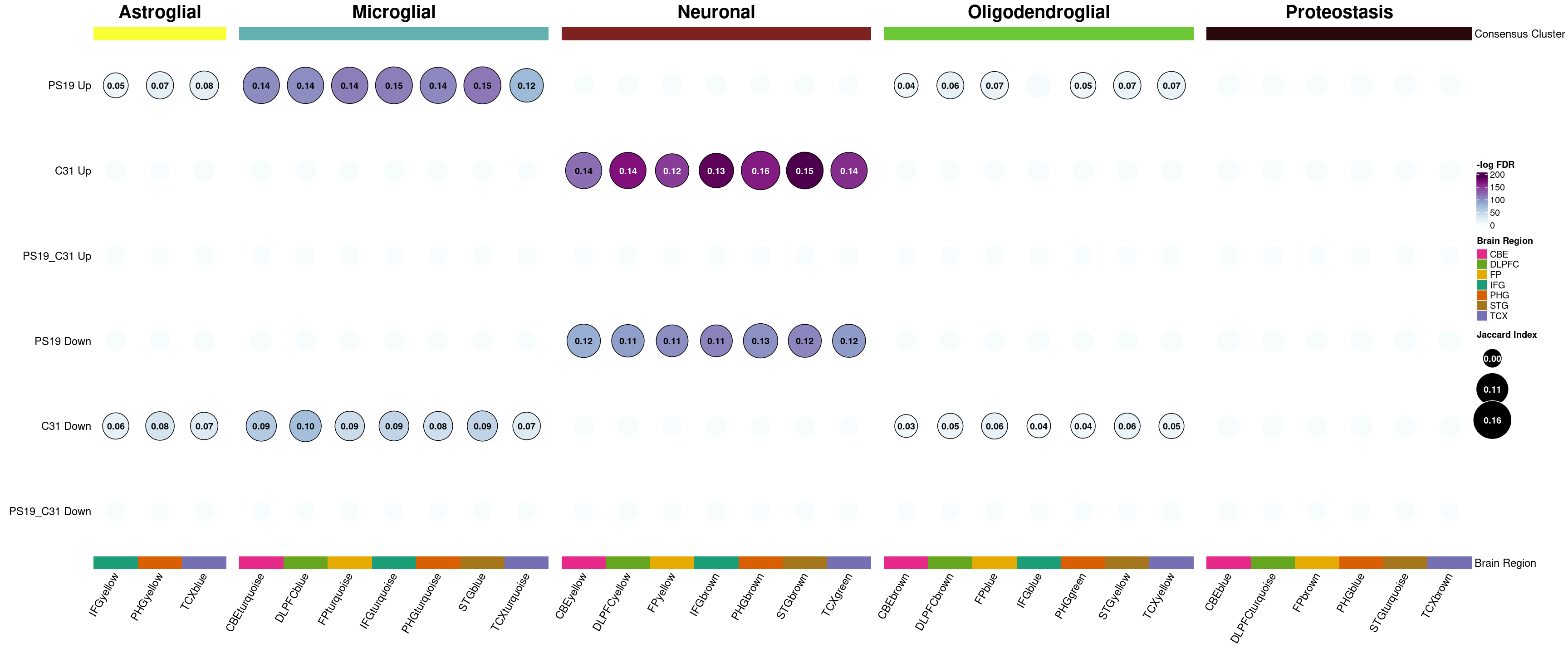
In this example plot, we see significant overlaps between astroglial/microglial-related modules and genes that are up in the genotype (PS19). At the same time, those modules show significant overlap with genes that are down in the drug (C31). Similarly, neuronal-related modules significantly overlap with genes that are down in the genotype and genes that are up in the drug. This suggests that the drug may be doing something to counteract the effects of the disease.
TREAT-AD correlation plot
The Treat-AD correlation tab shows the correlation between human AD expression data and our DE dataset for each TREAT-AD biodomain. Either the shrunken or unshrunken LFC is used in our dataset, as specified in the left-hand sidebar. No LFC or significance threshold is applied to the genes in order to gauge the broader overall trend.
Each circle in the plot represents the correlation between the respective groups of genes. The number in the circle is the correlation coefficient. The darker the blue, the more positive the correlation. The darker the red, the more negative the correlation. Non-significant correlations (where significant is defined as FDR < 0.05) are not displayed.
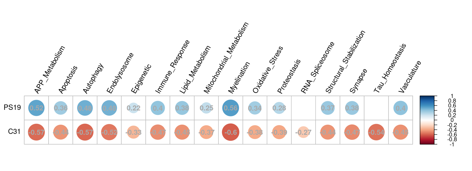
In this example plot, we see consistently positive correlations between human AD expression and the genotype (PS19) effect in our dataset across the different TREAT-AD biodomains. At the same time, human AD expression is negatively correlated with drug (C31) effect in our dataset. This suggests that our mice model resembles human AD in terms of expression profile, and the drug appears to counteract the effects of the disease.
L2FC correlation plot
The L2FC correlation tab shows the correlation between the genotype and drug effect in our DE dataset. Either the shrunken or unshrunken LFC for each gene is plotted, and only genes meeting the LFC criteria are included in the plot, as specified in the left-hand sidebar. Further, if unshrunken LFC is used, an additional significance filter (p-value < 0.05) is applied to exclude potential noise.
Each point in the plot represents a gene. The LFC for drug effect is plotted on the x-axis and LFC for genotype effect is plotted on the y-axis. The correlation coefficient and corresponding p-value are shown at the bottom left of the plot.
Try it out
Hover over each point in the plot to see the gene name and its LFC and p-value for both genotype and drug effect.
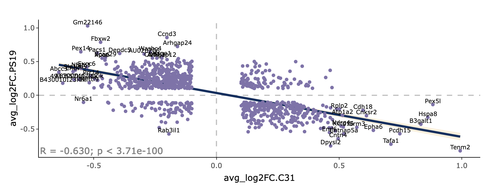
In this example plot, there is a moderate negative correlation between the genotype and drug effect, as indicated by the negative sloping trend line and the coefficient correlation. Genes that are upregulated by the disease are largely brought back down by the drug, and genes downregulated by the disease are largely brought back up. This suggests that the drug works to counteract the effect of the disease.
gProfiler results
The gProfiler grouped tabs show the gProfiler enrichment results in both graphical and tabular format, separately for the following gene categorizations: direct + indirect enhancement/suppression genes, only direct enhancement/suppression genes, and compensatory enhancement/suppression genes. The number of genes in each category can be seen in the Summary table tab.
gProfiler takes a list of ranked genes as input, and outputs enrichment from multiple sources including Gene Ontology terms, biological pathways, regulatory motifs of transcription factors, and more. We rank the input genes list by greatest combined absolute genotype and drug LFC, either shrunken or unshrunken as indicated in the left-hand sidebar.
Try it out
Toggle the gProfiler tab to expand and collapse the grouped tabs.
The gProfiler plot tabs show the enrichment analysis results in a Manhattan-like plot, separately for enhancement and suppression genes. Each point represents a functional term, and its data source is color-coded along the x-axis. The y-axis shows the adjusted enrichment p-values in negative log10 scale, where the higher the value, the more enriched the term.
Try it out
Hover over each point in the plot to show more details for each term as well as its adjusted enrichment p-value. Click on a point to see the term highlighted in both enhancement and suppression plots (if present).
The gProfiler table tabs show the enrichment analysis results in a tabular format. Each row represents a term. The Term size column indicates how many genes are in each term, and the Intersection columns show how many of those genes overlap with the enhancement and suppression genes. The corresponding p-values are also shown, where a smaller p-value indicates a stronger enrichment.
Try it out
Hover over the number of genes in the Intersection columns to see the specific genes that overlap with each term.
GSEA results
The GSEA grouped tabs show the gene set enrichment analysis (GSEA) results for each TREAT-AD biodomain in both graphical and tabular format, separately for the following effects: genotype, drug, and genotype + drug effect.
First, the mouse genes are mapped to human orthologs in order to query the human gene set database, which is more extensive. Mouse genes without a human ortholog are dropped. If multiple mouse genes map to the same human gene, the one with the greater absolute LFC is kept. The genes are ranked by descending LFC, either shrunken or unshrunken as indicated in the left-hand sidebar. An enrichment score can then be calculated for each gene set based on where its genes fall in the list of ranked genes.
Try it out
Toggle the GSEA tab to expand and collapse the grouped tabs.
The GSEA plot tabs show the enrichment analysis results in a graphical format. Each point represents a GO term, and its normalized enrichment score (NES) is plotted along the x-axis. A positive enrichment score occurs when genes in the gene set are largely up-regulated (i.e., most genes fall on the positive LFC end of the ranked genes list), while a negative enrichment score occurs when the genes are largely down-regulated (i.e., most genes fall on the negative end of the list). The enrichment scores are normalized by gene set size. The GO terms are grouped by TREAT-AD biodomain along the y-axis.
Try it out
Hover over each point in the plot to show the name of the GO term.
The relationship between the gene set enrichment for genotype and drug effect is summarized in the GSEA correlation tab. Each point represents a GO term, where its NES for drug effect is plotted on the x-axis and NES for genotype effect is plotted on the y-axis. Only terms that are significant (adjusted p-value < 0.05) in either genotype or drug effect (or both) are plotted.
Try it out
Hover over each point in the plot to show the name of the GO term and its NES and adjusted p-value for both genotype and drug effect. Click on each biodomain name in the legend to toggle the display of all gene sets belonging to that biodomain. Double-click on each biodomain name to toggle between selecting all and displaying just that one biodomain.
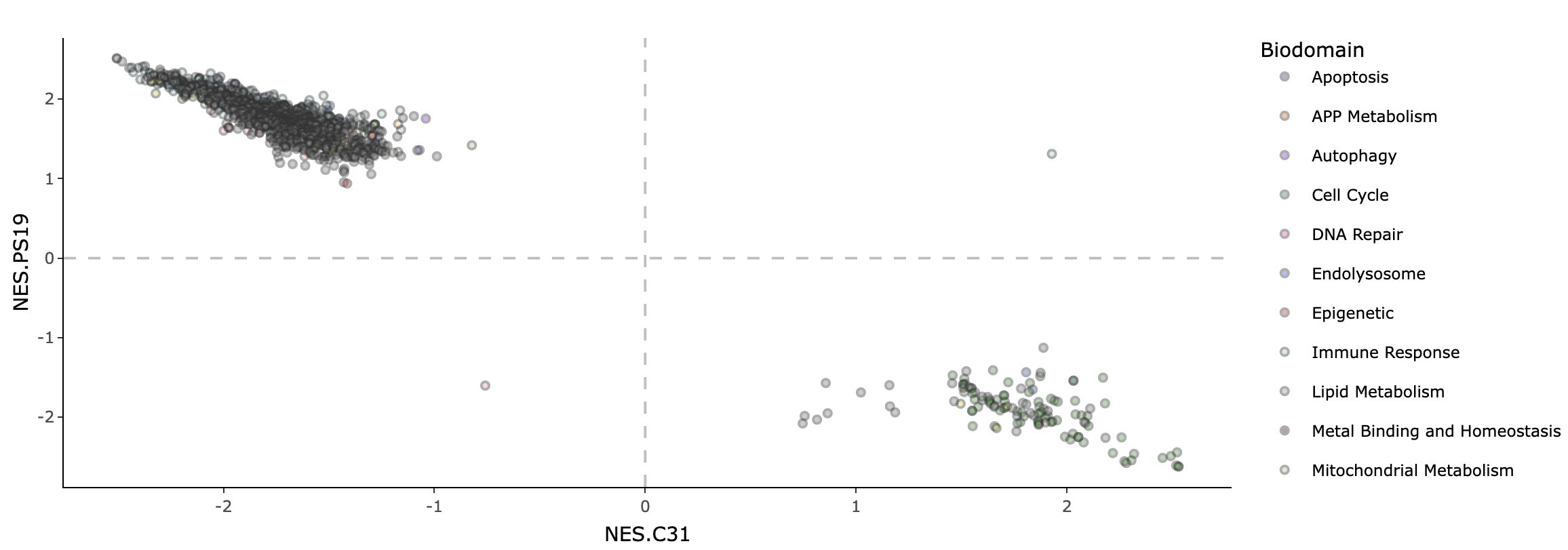
In this example plot, there is a strong negative correlation between the NES for genotype and drug effect across biodomains. This shows that many gene sets as a whole are being expressed in opposite directions for genotype and drug, suggesting the effectiveness of the drug in reversing effects of the disease.
The GSEA table tabs show the enrichment analysis results in a tabular format. Each row represents a term. The Term size column indicates how many genes are in each term, and the Biodomain column identifies which TREAT-AD biodomain the term belongs to. The corresponding NES and adjusted p-value are also shown.