Stimulation dashboard
For our projects that applied theta-burst stimulation (TBS) treatment, we include a link to a Stimulation dashboard. This page provides a tutorial on how to navigate the dashboard and interpret the results.
Try it out
Open a stimulation dashboard to follow along the tutorial.
If you haven’t already, review the DE dashboard tutorial first, as it covers many of the shared methods and topics.
Table of contents
Genes table
At the bottom half of the dashboard, under the Genes list tab, there is a table of genes used in the analysis. The Summary table tab contains summary and meta data. See the DE dashboard for more information about the genes table.
Stimulation analysis
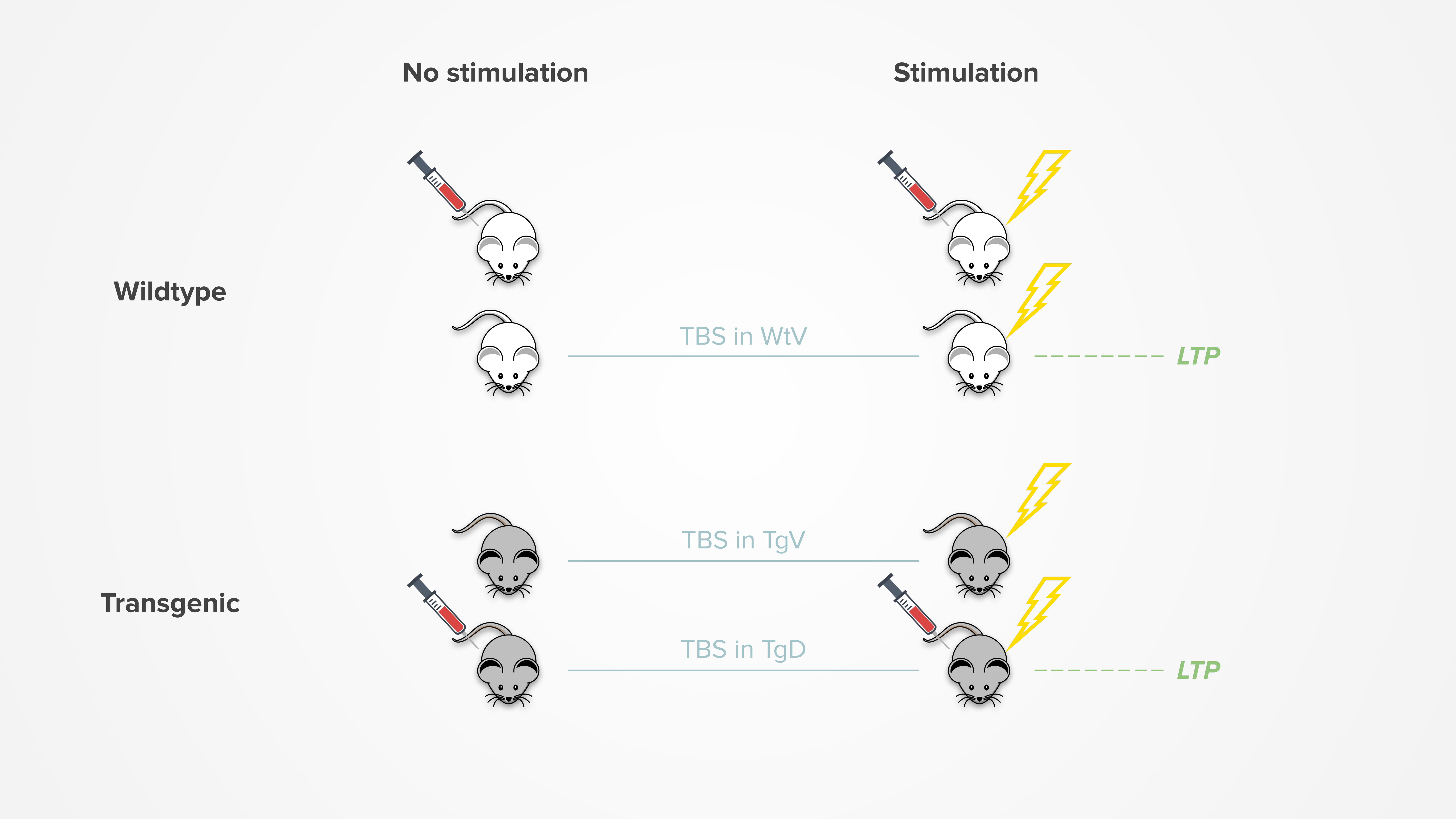
Long-term potentiation (LTP) is defined as the persistent strengthening of synapses following high-frequency stimulation. It is particularly important for learning and memory, thus often studied using hippocampal slices of the brain.
Our projects use TBS treatment in attempt to induce LTP activity. It is found that TBS can successfully induce LTP in wildtype vehicle (WtV) and drug-treated transgenic (TgD) mice, but not transgenic vehicle (TgV) mice. This suggests that the drugs can help to restore the ability to maintain LTP.
The figure below summarizes the effects of TBS:
Categorization
To determine which genes are relevant to inducing LTP activity, we can compare the stimulation effect of each gene in the transgenic vehicle mice (which did not induce LTP) to its effect in the wildtype vehicle mice (which successfully induced LTP). Genes whose log fold change (LFC) differ between the two groups are interesting, as we want to identify genes whose expression becomes more up or down-regulated as a result of LTP.
To visualize this, we can plot the LFC for stimulation effect in WtV mice on the x-axis against the difference in LFC between TgV and WtV on the y-axis. This allows us to define the following 4 categories of genes corresponding to each of the 4 quadrants. Use the animation below to explore how this is derived.
- LTP-dependent gain:
- Up in WtV and down in TgV
- Up in WtV and also up in TgV but to a lesser extent
- LTP-dependent loss:
- Down in WtV and up in TgV
- Down in WtV and also down in TgV but to a lesser extent
- Shared gain:
- Up in WtV and also up in TgV but to a greater extent
- Shared loss:
- Down in WtV and also down in TgV but to a greater extent
As seen above, the dashed line at y = x in the WtV vs. TgV plot represents cases where the gene LFC would be equal in both groups. The activity-dependent genes can be defined as genes that deviate away from that line, specifically ones that have a greater effect in the WtV group than TgV group.
The Category column in the genes list table can be used to filter for genes that fall into each category. The number of genes per category can be found in the Summary table tab.
Only genes that are significant in the WtV and TgD (LTP) groups or in the TgV (no LTP) group are included, where significance is defined by meeting a LFC threshold and having a p-adj < 0.05. See the Summary table tab for the specific LFC threshold used and whether the shrunken or unshrunken LFC is used.
Analysis results
The main analysis results are located in the top half of the dashboard. A short description of each type of result and how to interpret them can be found below.
Modules enrichment plot
The Modules enrichment tab shows the Fisher’s exact enrichment of each of the modules with our DE dataset.
Try it out
Use the buttons above the plot to toggle between the results for each module.
Each column in the plot is a module and each row is a subset of genes in our dataset, as defined by being up or down in stimulation effect in the wildtype vehicle, transgenic vehicle, and drug-treated transgenic mice. The genes are filtered using the same LFC and significance thresholds described in the Summary table tab.
See the DE dashboard for more information about the plot and how to interpret it.
TREAT-AD correlation plot
The Treat-AD correlation tab shows the correlation between human AD expression data and our DE dataset for each TREAT-AD biodomain.
See the DE dashboard for more information about the plot and how to interpret it.
L2FC correlation plot
The L2FC correlation tab shows the scatterplot as described in the gene categories section. In addition to the WtV vs. (TgV - WtV) comparison, the TgD vs. (TgV - TgD) comparison is also included as a way of exploring how the LTP-restored TgD mice compare to the WtV mice.
Try it out
Use the radio buttons to switch between the WtV vs. (TgV - WtV) and TgD vs. (TgV - TgD) comparisons.
Each point in the plot represents a gene. Genes lying in each of the 4 quadrants belong to one of the categories defined above. The color of the point indicates whether the gene is significant in TgV, WtV (or TgD), or both.
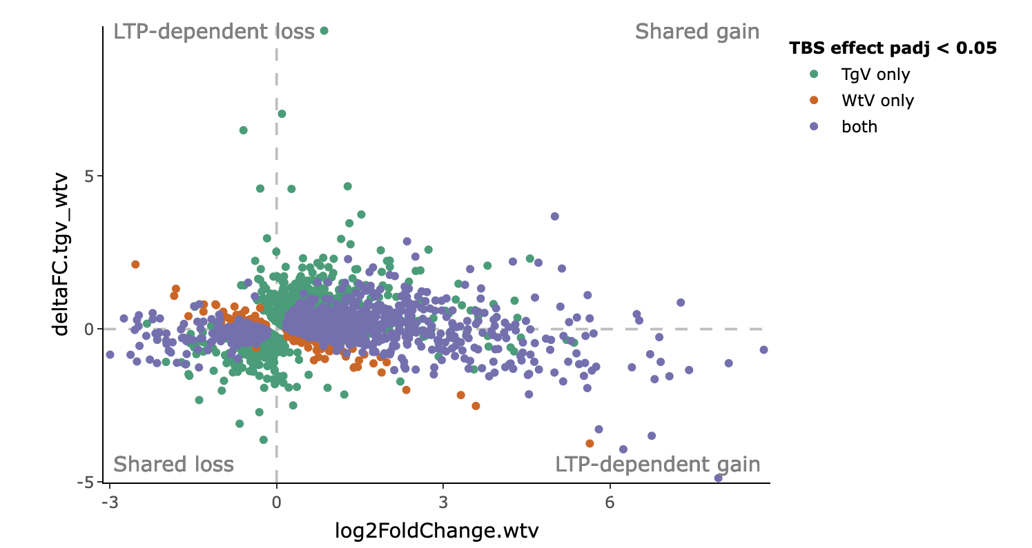
As seen in this example plot, we can identify LTP-dependent genes by looking at the second and forth quadrants. Most of the LTP-dependent genes are significant only in the WtV, where LTP is successfully induced. On the other hand, the shared genes are largely ones that are significant in both WtV and TgV.
gProfiler results
The next 4 tabs show the gProfiler enrichment results in both graphical and tabular format, separately for each of the 4 gene categorizations. The number of genes in each category can be seen in the Summary table tab.
See the DE dashboard for more information about the gProfiler results and how to interpret them.
GO terms enrichment plot
The GO terms enrichment tabs show the top up and downregulated GO terms in each experimental group. First, the genes are filtered using the same LFC and significance thresholds described in the Summary table tab. Then, they are split into up and downregulated genes and gProfiler is used to obtain the top enriched terms.
Try it out
Use the filters to select which Gene Ontology terms to display (Biological Process (BP), Molecular Function (MF), or Cellular Component (CC)), how many top terms from each experimental group to show, and the term size limit of the terms to include.
Each GO term is plotted as a bar along the y-axis, where the length of the bars reflect its adjusted enrichment p-values in negative log10 scale. Terms enriched for the downregulated genes are flipped so they are plotted along the negative end of the x-axis.
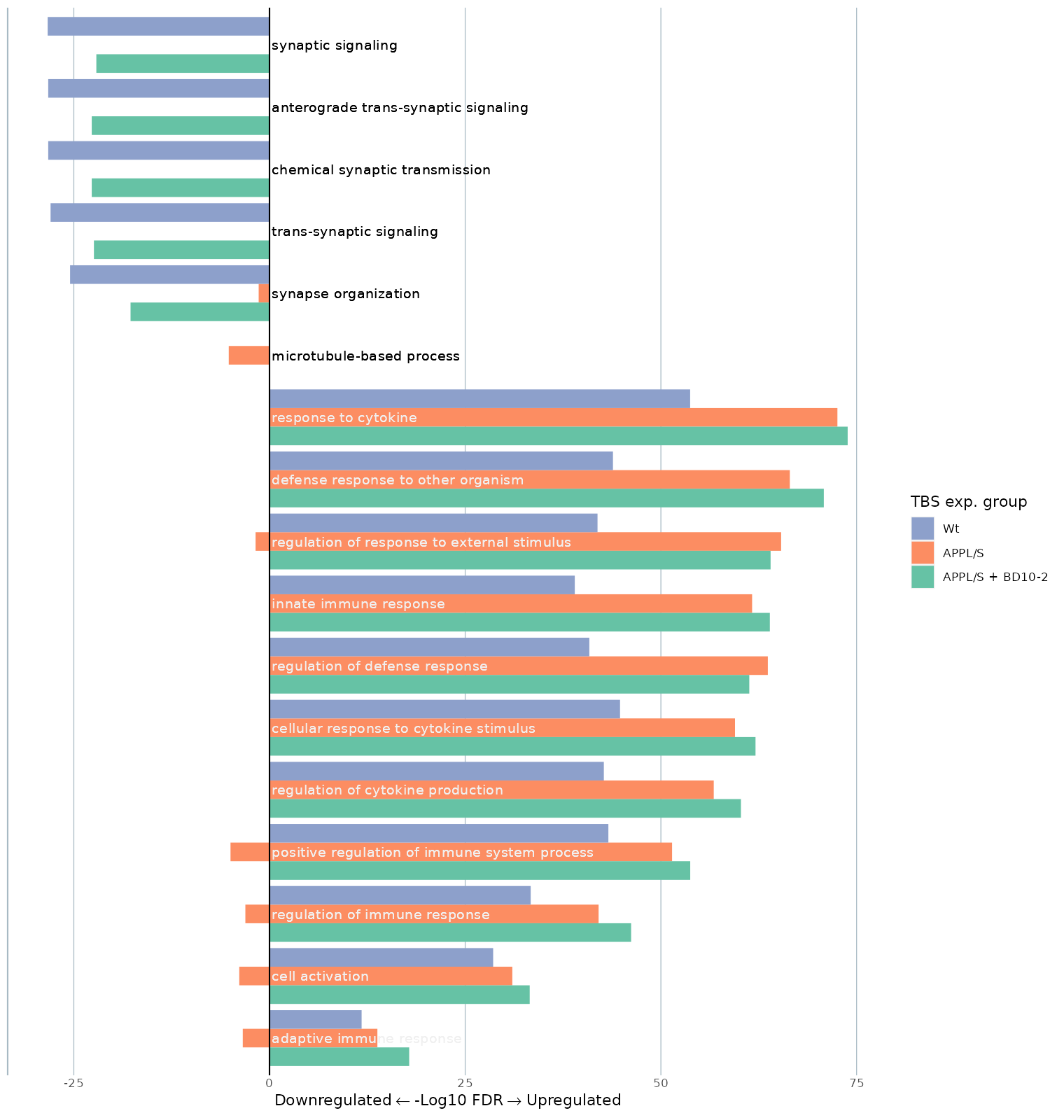
In this example plot, we see the top 5 GO:BP terms for each experimental group being plotted, where only terms under the size of 1000 are included. As seen, the top terms for upregulated genes are largely shared across all 3 experimental groups. On the other hand, the top terms for downregulated genes are generally shared only between the WtV and TgD groups (which successfully induced LTP), but not TgV (which did not induce LTP). Specifically, the terms enriched for the LTP groups are all synaptic related, indicating that these processes may be related to LTP.